Introduction
Mobile devices have become an integral part of our daily lives. We rely on them for various tasks and activities, including browsing the internet on the go. As a result, it has become crucial for businesses and website owners to adapt their designs to cater to the needs of mobile users. This blog post explores the concept of mobile-first design and the importance of optimizing visual content for on-the-go audiences.
Importance of Mobile-First Design
With the rapid increase in mobile device usage, it has become crucial for businesses to prioritize mobile-first design. Mobile devices have now surpassed desktops as the primary medium for accessing the internet. Therefore, optimizing visual content for on-the-go audiences is essential to ensure a seamless user experience and engage mobile users effectively.
Responsive Web Design
One of the key components of mobile-first design is responsive web design. Responsive design allows websites to adapt to different screen sizes and resolutions, ensuring that the visual content is displayed optimally across various devices. By implementing responsive design techniques, businesses can provide a consistent and user-friendly experience to their mobile audience.
Fluid Grid System
A fluid grid system is a fundamental aspect of responsive web design. It enables the adjustment of website layout and content based on the screen size. With a fluid grid system, visual content can be flexibly resized and rearranged, making it easier for users to consume information on smaller screens without sacrificing usability.
Flexible Images
In a mobile-first design, images need to be optimized for different screen sizes. Flexible images adjust their size and resolution based on the device, ensuring that they are neither too small nor too large. This optimization strategy helps maintain image quality while minimizing load times and data usage for mobile users.
Minimalistic Approach
When it comes to mobile-first design, less is more. Mobile screens have limited space, and cluttered visual content can overwhelm users. By adopting a minimalistic approach, businesses can improve the overall user experience and ensure that the most important information stands out. Minimalistic designs with ample white space, clear typography, and strategically placed visuals allow users to focus on the key elements without distractions.
High-Quality Visuals
While a minimalistic approach is essential, it does not mean compromising on the quality of visual content. Mobile-first design should still prioritize high-quality visuals that are visually appealing, relevant, and engaging. High-resolution images, videos, and graphics can significantly enhance the user experience and capture the attention of on-the-go audiences.
Compression Techniques
Optimizing visual content for mobile devices also involves utilizing compression techniques to reduce file sizes without significant loss of quality. By compressing images and videos, businesses can enhance load times and reduce data usage, ensuring a seamless experience for mobile users even with slower internet connections.
Retina Display Optimization
With the rise of high-resolution screens on mobile devices, optimizing visual content for retina displays has become crucial. Retina display optimization ensures that images and graphics appear sharp and crisp on devices with high pixel densities, providing a visually pleasing experience for mobile users.
User-Friendly Navigation
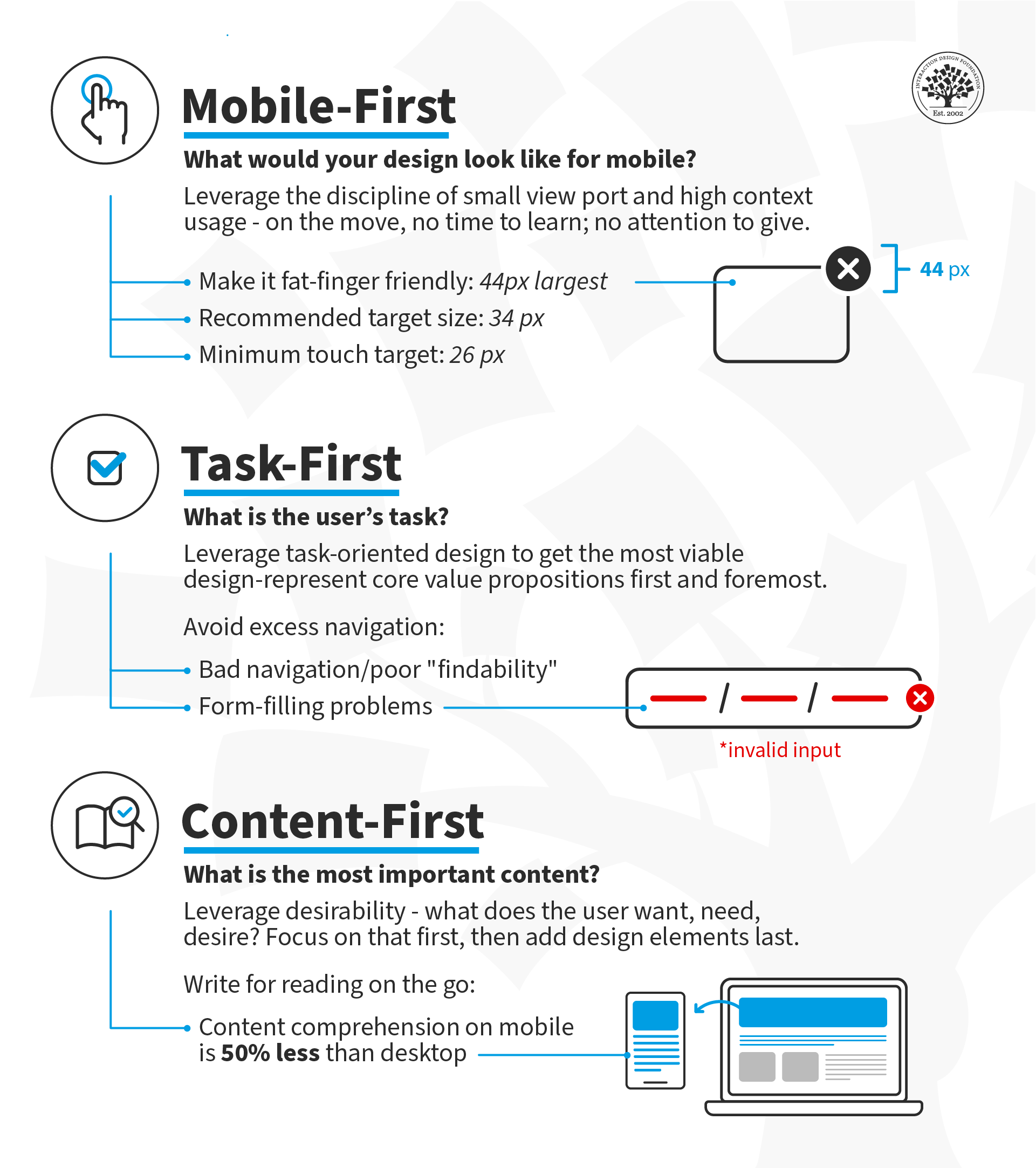
A crucial aspect of mobile-first design is creating a user-friendly navigation system. Mobile users typically have limited attention spans and are often multitasking while browsing. Therefore, it is essential to have clear and concise navigation menus that allow users to easily find the information they are looking for. Implementing intuitive navigation techniques such as hamburger menus, dropdowns, and scrollable menus can greatly enhance the user experience on mobile devices.
Mobile-First Design: Optimizing Visual Content for On-the-Go Audiences
Summary
In today’s fast-paced world, people are constantly on the move, relying heavily on their smartphones and tablets to access information. This shift in consumer behavior has prompted the need for mobile-first design strategies. Mobile-first design puts mobile users at the forefront of the design process, ensuring that their browsing experience is smooth, enjoyable, and efficient.
One of the key aspects of mobile-first design is optimizing visual content for mobile devices. Websites need to display images, videos, and other visual elements in a way that is visually appealing and doesn’t compromise the loading speed. Slow-loading pages can lead to frustration and a higher bounce rate.
To optimize visual content for mobile, it’s important to consider factors such as image compression, responsive design, and mobile-friendly formats. This helps reduce the file size of images without sacrificing quality, ensures that the content adapts to different screen sizes and orientations, and utilizes formats that are compatible with mobile devices.
By implementing mobile-first design principles a their explanation nd optimizing visual content, businesses and website owners can provide a seamless and engaging browsing experience for their on-the-go audiences.

Hello, I’m Brodie Groom, a professional Content Writer specializing in SEO Testing, Algorithm Research, Ranking Analysis, and Data Analytics. With a passion for all things digital, I thrive on helping businesses optimize their online presence and achieve their goals through strategic content creation.